 Sparkle Cedar-a nice taupe with a lot of sparkle to it. It appears to me to have a slight hint of green to it while still remaining on the cooler side of the spectrum.
Taupe Pearl-named quite literally. It's a taupe eyeshadow with a pearl finish. It's nice, but not horribly unique to me in any way. I'm not really complaining for $5 though
Iced Mocha- one of my oldest NYX singles; it's a bit warmer than Taupe Pearl, but the two are fairly similar.
The last two swatches of this set are both NYX Root Beer-both were bought at different times from different places, but both have the same name and look very different from each other. The first one, has a considerable amount more purple tones to it and is a lighter taupey color. The second is a richer brown-taupe with a hint of pruple, but it's a much less strong purple tone than the other one. I had bought the second one after depotting the first one and being left with regret. However, I discovered after coming home with it that the two colors were not identical; and therefore felt the need to keep both. Seeing the two of these next to each other, I can see why people have argued about whether or not NYX Root Beer is considered a dupe for the elusive MAC Moth Brown. (I'd say one of the versions is probably close)..which I suppose leads me to my title question; Quality Control anyone? It's a bit silly to have shades that are so inconsistent among batches..

 Skin Tight-a light warm peachy skintone like shade with golden peach sparkle. This is pretty without lending too much color on my eyes.
Champagne-the color apples turn when they start oxidizing...only shimmery. I don't feel like Champagne is a real Champagne color, but it's still a nice color.
Flamingo- a nice, dirty pink/gold duochromish shadow. I like this shade quite a bit, but I find it harder and more difficult to work with than the rest of my NYX.
Deep Bronze-the name fits the shade on this one. I don't have a whole lot to say on it
Silver-a nice silver shade without too many blue tones.

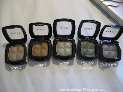
 Khaki- a pretty green shade with a hint of grey
Herb- a warm bronzed green
Green Tea- I kinda like this shade..it's a dirty seafoam greem type of color with a silvery pearl to it...just beautiful
Hunter green- a deeper green-grey shade
Charcoal-gunmetal grey

ooo! Thanks for the swatches! I want to pick up some of these shadows!
ReplyDelete